UI / UX Design
cinemark mobile app redesign
This redesign project focused on transforming their mobile application into a more intuitive, visually appealing, and user-friendly platform that enhances the entire movie-going journey.
Year :
2025
Industry :
Entertainment & Media
Client :
Cinemark
Project Duration :
2 weeks

Problem :
The app's outdated design fails to capture the premium cinema experience that Cinemark provides, while poor visual hierarchy and content organization create barriers to movie discovery and engagement.

Solution :
To solve the identified barriers to engagement, the redesign focused on three key pillars:
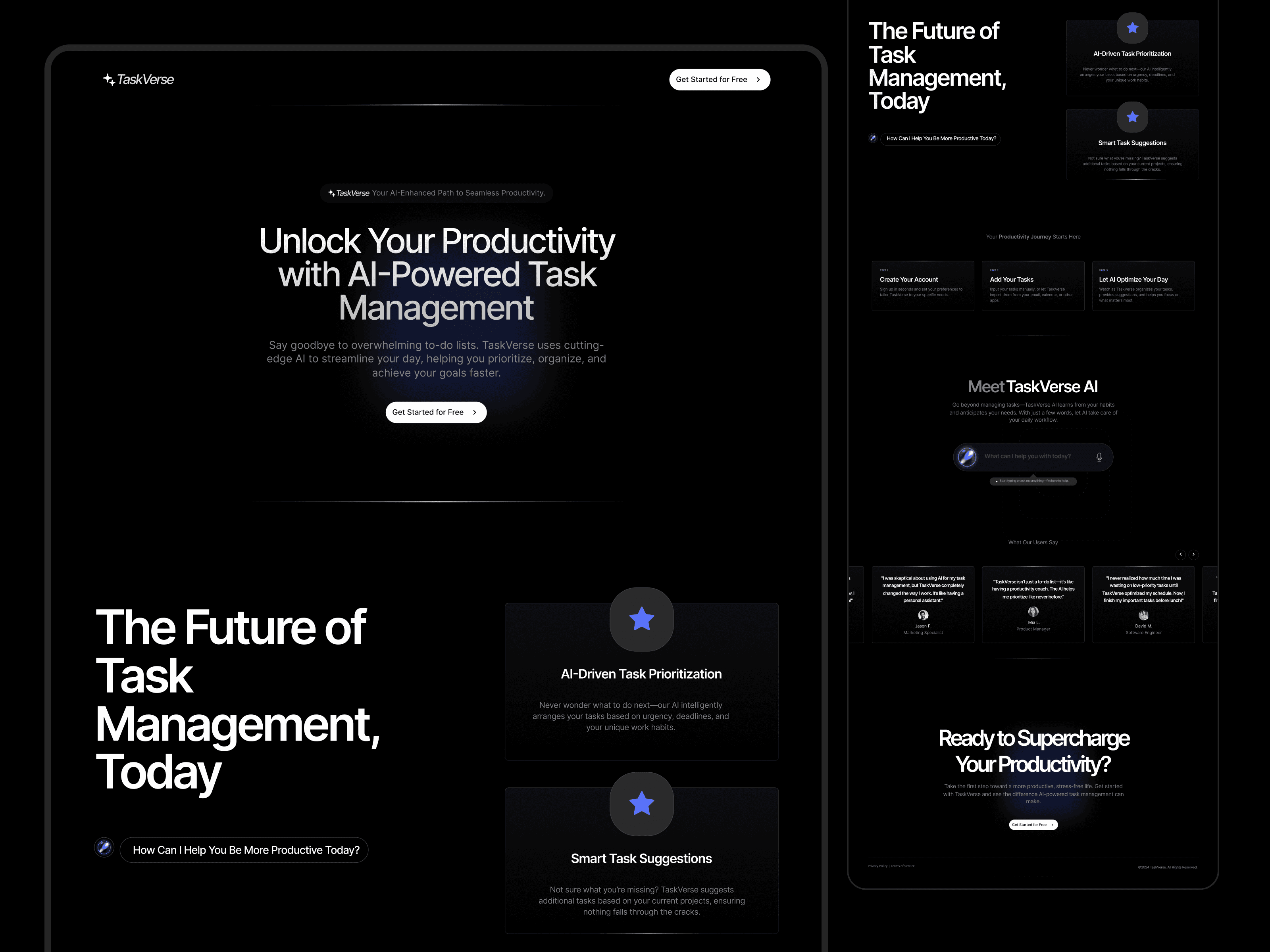
Modernized Brand Identity: Developed a premium "Cinema-First" aesthetic using a dark palette and the Poppins typeface to align the digital experience with Cinemark’s worldwide reputation.
Enhanced Information Hierarchy: Improved visual contrast and decluttered the interface, making it easier for users like Sarah to locate essential information and navigate the app without confusion.
Intuitive Content Discovery: Introduced clear categorization and filtering options for movie lists, streamlining the journey from discovery to the theater seat.


Challenge :
The primary challenge was to bridge the gap between Cinemark’s premium global reputation and its outdated mobile experience. The existing app suffered from a cluttered interface and poor visual hierarchy, which created significant barriers for users trying to discover content or book tickets. The goal was to transform a confusing, information-heavy platform into a seamless, intuitive, and visually immersive journey that reflects the excitement of going to the cinema.
Summary :
This project involved a comprehensive redesign of the Cinemark mobile app, one of the world's largest movie theater chains. By identifying key pain points such as visual inconsistencies and content discovery limitations, I transformed the outdated interface into a premium, dark-mode experience. The final design prioritizes intuitive navigation and a clean visual hierarchy, ensuring a seamless journey from movie selection to ticket booking.


UI / UX Design
cinemark mobile app redesign
This redesign project focused on transforming their mobile application into a more intuitive, visually appealing, and user-friendly platform that enhances the entire movie-going journey.
Year :
2025
Industry :
Entertainment & Media
Client :
Cinemark
Project Duration :
2 weeks
Problem :
The app's outdated design fails to capture the premium cinema experience that Cinemark provides, while poor visual hierarchy and content organization create barriers to movie discovery and engagement.
Solution :
To solve the identified barriers to engagement, the redesign focused on three key pillars:
Modernized Brand Identity: Developed a premium "Cinema-First" aesthetic using a dark palette and the Poppins typeface to align the digital experience with Cinemark’s worldwide reputation.
Enhanced Information Hierarchy: Improved visual contrast and decluttered the interface, making it easier for users like Sarah to locate essential information and navigate the app without confusion.
Intuitive Content Discovery: Introduced clear categorization and filtering options for movie lists, streamlining the journey from discovery to the theater seat.
Challenge :
The primary challenge was to bridge the gap between Cinemark’s premium global reputation and its outdated mobile experience. The existing app suffered from a cluttered interface and poor visual hierarchy, which created significant barriers for users trying to discover content or book tickets. The goal was to transform a confusing, information-heavy platform into a seamless, intuitive, and visually immersive journey that reflects the excitement of going to the cinema.
Summary :
This project involved a comprehensive redesign of the Cinemark mobile app, one of the world's largest movie theater chains. By identifying key pain points such as visual inconsistencies and content discovery limitations, I transformed the outdated interface into a premium, dark-mode experience. The final design prioritizes intuitive navigation and a clean visual hierarchy, ensuring a seamless journey from movie selection to ticket booking.